TherapySelector - UX-UI Design medical app
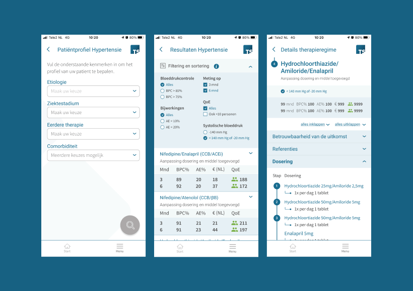
The TherapySelector app on desktop or smartphone allows the physician to create a patient profile with four clicks and, based on the outcomes of all published treatments for that patient profile, choose the best fitting individual treatment within one minute.
Personalised, data-driven therapy selection
By providing original data on the outcome of licensed treatments clustered by patient profiles, TherapySelector supports physicians in making their own treatment decision that is both evidence-based and person centered.
TherapySelector is determined to improve health, and therefore human well-being, worldwide by enriching medical science with personalised, data-driven therapy selection.
From selling mobile phones to helpen physicians
In March 2022, I was asked by Karin Scheidel of TherapySelector for the UX/UI Design of the TherapySelector mobile app. Karin Scheidel and I know each other well from our collaboration at KPN, one of the largest telecommunications providers in the Netherlands. There we worked together intensively and for a long time in the 'Mobile Sales' department of the KPN webshop, selling cell phones.
Challenge / problem
A lot of data
I was asked as Freelance UX/UI Designer because the former Freelance UX/UI Designer quit. TherapySelector's main challenge is that on the one hand, they have a lot of data on hand about medical treatments for specific diseases such as hepatitis and hypertension.
Highly professional target audience; specialist physicians
On the other hand, they have a highly professional target audience; specialist physicians. An additional challenge is that all the data has to be visually presented in the relatively small interface of a cell phone (iPhone and Android).
Lack of design structure
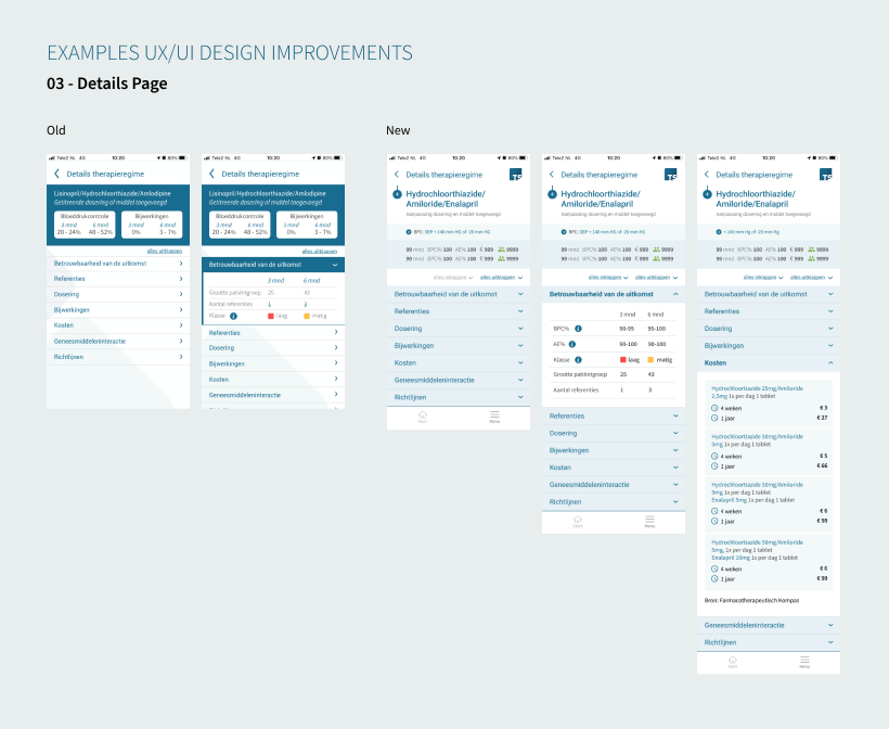
When I joined TherapySelector, they were working with Adobe XD as their design software. Without using a well established Design System and a central library. The designs did not make sufficient use of the capabilities of the colour palette of the corporate visual identity. There was also insufficient hierarchy in the typography.
Solution
Switching to Figma
After working with Adobe XD for about 6 months, we switched to market leader on UX/UI Design software Figma on my initiative. A clean Design System was started, shades of colours were introduced in the interface to better distinguish between the different types of information, and more structure in the typography was introduced.
Small iterations
At this time, collaboration with TherapySelector continues and we continue to improve the interface each time in small iterations and based on user research. The marketing materials are also slowly being redesigned.
WCAG 2.1 Guidelines for web accessibility
Recently I was asked to check the UX/UI Designs against the W3C WCAG 2.1 guidelines. To provide sufficient support I enrolled in several extensive online courses to update my knowledge on web accessibility.
Relevant project: Lyla Sleep Coach
Make sure to also check out the relevant project I did for online sleep coach Lyla Coach.
A 'Conversational UI (User Interface)' formed the core of the Lyla Coach sleep app. Sleep (and falling asleep) is not a natural part of every day for many people. The Lyla Sleep Coach app offered sleep training, based on five years of scientific research by the University of Utrecht (the Netherlands) into sleep problems. As a Freelance UX/UI Designer I designed the UX/UI Design of this Android app.
Need help with your UX/UI Design?
Feel free to contact me! I'd love to help you out.


