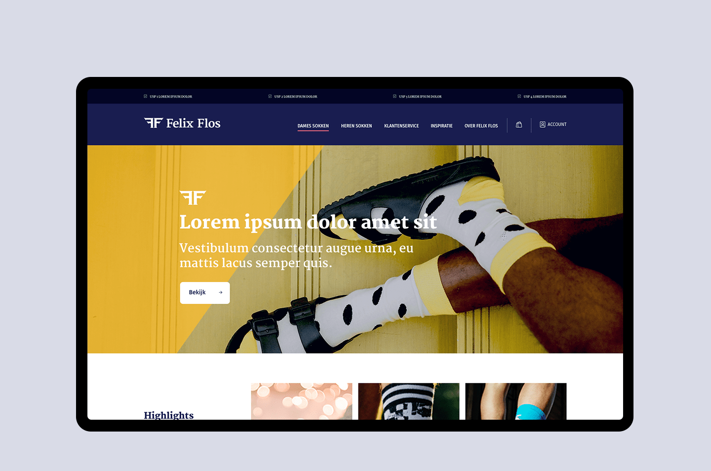
MJR TOM UX/UI re-design website
MJR TOM
Striking backpacks
They also do that for MJR TOM. MJR TOM is known for its striking backpacks with flag, at events, festivals and concerts. Founded in 1996, they have been specialists in mobile catering services for over 20 years. Mobile catering means extra service to the visitors of an event. And therefore an increase in turnover for the client through an extra sales moment.
Limited set of three templates, only as Desktop variant
Limited budget
Website development is not Reason's core business. But it is part of the services offered. Partly because of this, there was not much budget available for this specific project of MJR TOM. In consultation it was therefore decided to design a very limited set of three website templates. And only deliver these templates in a Desktop version.
Reason itself has website development available in-house. And was therefore able to quickly translate the supplied UX/UI design into a working responsive website.
Separation of the thought processes ensures a better result
Wireframes / UX Design
I believe in separating thought processes. UX Design is really a different field today than Visual Design / UI Design. By separating these, a higher quality end result is created.
I chose to deliver a complete website for MJR TOM. With a wireframe for each page. This made it very clear why which information belongs in a certain place in the customer journey. Separation of the thought processes ensures a better result.
Visual Design / UI Design
Without an extensive house style guide
As part of the next step, Mr. Upside briefly searched for the right look. MJR TOM did not have an extensive house style guide available at the time of the design. Reason asked Mr. Upside to provide three key templates, based on the wireframes created earlier and, at Reason's request, only in Desktop variant.
Need help with your UX/UI Design?
Feel free to contact me! I'd love to help you with your UX/UI design.


