Felix Flos webshop redesign
FelixFlos.nl sells self-produced more luxurious socks in the higher market segment. In 2018, Ritu Ramlal, together with his partner and co-owner Hedy Bootsma, set up the webshop in socks. Ritu approached me as a Freelance UX/UI Designer to take webshop design to the next level.
Corporate Social Responsibility
Lucky flower
The name Felix Flos means lucky flower in Latin. Ritu and Hedy believe in the power of fair sharing and believe that everyone should have a chance to 'bloom'. Although that sounds a bit floaty, Felix Flos is far from floaty. They are, and remain, a webshop where sales are important. But with a clear social mission.
A better education for children in India
They work closely with companies and institutions that also want to contribute to a better world. This may not always yield the best return. But the best feeling.
In other words: beautiful, classic cotton socks for the classy man and woman. But at the same time also school fees, school books and school buses for underprivileged children in India.
Parvati Foundation
One of the companies that Felix Flos works with is the Parvati Foundation. The Parvati Foundation was founded after two months of volunteering in India, by Jamilah Mohuddy. The volunteer work made her realize that education is the most important means against poverty in the world.
The foundation has now been active for almost 10 years in the southernmost state of India, Tamil Nadu. She is specifically committed to helping children in the poorest layer of the population and improving their education. So that ultimately these children can help themselves, and their families, out of poverty.
Read more about how Felix Flos collaborates with the Parvati Foundation.
MTB Maastricht
In addition to the Dutch Parvati Foundation, Felix Flos also works with (Dutch) companies such as MTB Maastricht for the packaging and distribution of the socks.
Wordpress with WooCommerce
The Felix Flos webshop can be viewed at www.felixflos.nl. The webshop is built on the Wordpress CMS. Using the e-commerce platform WooCommerce. Web builder Flekto.nl was responsible for the technical development of the web store.
Challenges
Felix Flos previously worked with a web agency for the design, construction and maintenance of the webshop. But decided in 2018 to look for another partner.
As a Freelance UX/UI Designer, I responded to Ritu's call on a platform for Freelancers, saying that I probably wouldn't be the cheapest party. That didn't stop Felix Flos.
Insufficient reflection of the brand
The problem with Felix Flos in 2019 was that its brand positioning was not sufficiently reflected in the webshop. And all branding. Felix Flos positions itself with its products in the higher market segment. Between Falke on the one hand and Happy Socks on the other. At that time, that positioning was not yet fully reflected in the design (UI Design) of the website.
Feminine
The web agency had given the web shop an emphatically feminine appearance. With pink color accents and graceful typography. That did not match the balanced balance between men and women in the target group. But also not with the business need for quality, luxury and comfort of that target group.
UX Design
In addition to the Brand Design, the Visual (UI) Design, the UX Design could also be improved on quite a few points.
Research
Where are the challenges?
You can't offer a good solution if you don't know exactly where the problem is. That's why Ritu and I talked extensively about the Felix Flos brand. And the role of the webshop in this. I also extensively researched the existing shop, with a Mr. Upside Site Scan. And then communicated my findings in an Invision presentation. This created a good basis for all the design choices that would follow.
Insights
A number of interesting insights emerged from the Site Scan:
For example, Felix Flos lacked a distinct, distinctive character; it was more of the same in the market.
Felix Flos' mission and social responsibility were also barely mentioned.
Due to their size, the headlines 'screamed' as if Felix Flos was standing with a stall at the weekly market. While the higher market segment where the high-quality socks belong, requires a calm, confident attitude.
The visual language from the logo was not reflected anywhere in the brand expressions. Which made the branding inconsistent. The letter logo was also dramatically spaced, difficult to read in small format and did not radiate the quality that befits the products.
The photography used consisted only of product shots. There were hardly any people to be seen. By adding more human experience and atmosphere in photography, the potential customer gets a better feeling that the product is also intended for him or her. And that the socks are more than just a cotton shell for your feet.
Complete re-design of the webshop in four steps
It became clear that the business goal, a well-converting webshop as a suitable brand expression within a strong brand, could only be achieved if the webshop was adapted across the entire width.
Step 1 – Corporate Identity
Designing a specific brand expression, such as a webshop, without the overarching house style in order, is inconvenient. That is why it was decided to first raise the house style to a higher level. And above all, well documented. Even before we would start designing a webshop.
Typography played an important role in these improvements. Because the right typography in particular can provide the desired more luxurious look.
Step 2 – Flowchart and Wireframes
When designing digital applications, I always advocate separating UX and UI design processes. So 'form follows function'. A good effect is, certainly in a webshop, much more important than taste-related appearance.
Therefore, focus first on the design of the operation. The UX Design. First answer the functional questions such as: 'How does the customer go through the webshop as smoothly, quickly and efficiently as possible?', 'Why do we put the buttons exactly there?' and 'What information do we show in the shopping cart?'.
Step 3 – Visual design
Only after the design of the operation, the focus is on the appearance. The UI Design. Then you determine what color a button should have, how big the headers should be and which photos or illustrations are used.
Because of the separation, these two thought processes do not overlap. This prevents beautiful images from hiding important errors in the operation (conversion) of the webshop.
A nice button in the wrong place usually results in a lower conversion than an ugly button in exactly the right place. Amazon is the classic example of a high-converting website that will never win a beauty prize.
Step 4 – Wordpress and WooCommerce
Web builder Flekto joined as a technical partner. My Sketch files and a link to the Zeplin files would be delivered by me to Flekto after approval of the design, together with an oral and textual explanation.
Flekto specialises in Wordpress and WooCommerce webshops, and turned out to be a valuable sparring partner in the Felix Flos process.
Design Phase
In the right order
In the third phase, the Design Phase, the insights from the first Research Phase and the Site Scan were included in the implementation of the strategic steps from the second, Strategy Phase. That order is important.
From the various conversations with Ritu, it appeared that a logo and letter logo combination had already been designed in the past. That letter logo seemed to have room for improvement. But the logo was very useful.
Logo
The two 'F'-shapes, which are back-to-back, fit well with the Felix Flos concept. They form a solid pillar, almost a platform. One "F" shape stands for the commercial part. The other 'F'-shape for the CSR part of Felix Flos. The more classic serifs on the F create a desirable fashion appearance. In addition, the shape is perfect for use above and next to a letter logo.
Letter logo
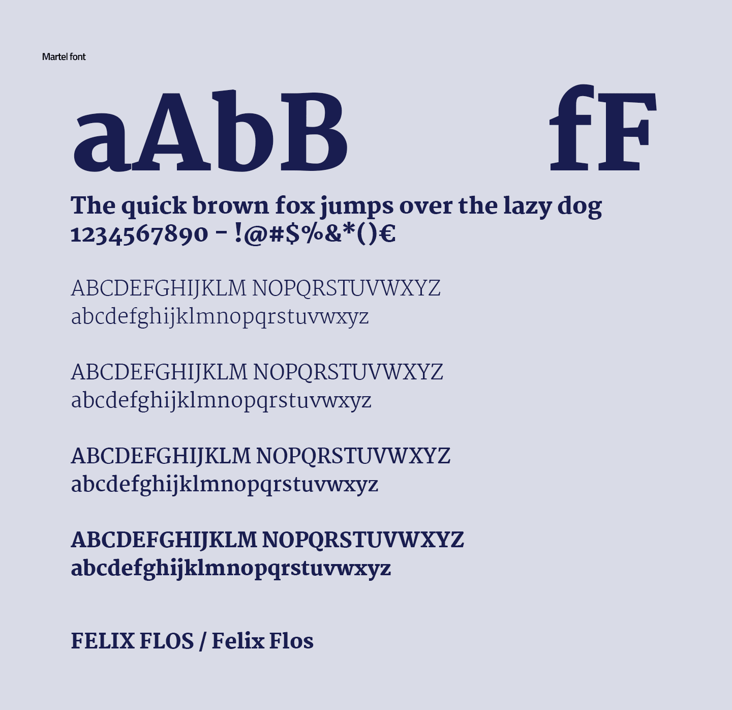
The letter logo was less good. The spacing is incorrect and the font was not directly created for use online. It also lacked enough weights in the family to be useful in an interface. After research, Google Font Martel was selected as the font and slightly modified.
Martel font
Martel has a nice Euro sign which is useful for a webshop. And because the numbers of the font are below the baseline, the recognisability of amounts is improved. The advantage of free Google Fonts is that they are optimised for use in online applications. Martel also has many weights available. As a result, longer texts, such as blogs, can be easily structured with various headers.
Colors and graphic patterns
After the typography had been established, an appropriate color palette was designed. And graphic patterns are presented. Although a lot of attention is often paid to the logo, a logo for customers is actually only a small part of the corporate identity. In practice, the customer comes into contact with the other corporate identity components more often and more intensively; colours, shapes, patterns and images (photography and illustrations).
Flowchart and Wireframes
After establishing and expanding the house style, the information structure of the webshop was started. This is recorded in a Flowchart. Then Wireframes were designed, in which the content of a page was determined. Questions such as 'which buttons can users click on and where do they end up?' have been answered and various customer journeys have been tested.
Visual Design
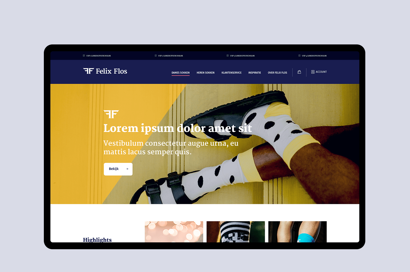
Subsequently, the Wireframes and the more extensive house style were combined into a balanced interface. Where Style Examples are designed first. And then 16 webshop templates, including an Account section.
Beautiful, well-working end result
A successful, custom-designed webshop
The result is a successful, custom designed and built webshop, based on Wordpress and WooCommerce. The collaboration with Felix Flos went so well that Mr. Upside was also asked to handle the Art Direction of photoshoots, packaging and sock label design, Social Media content and the copywriting of blog posts.
Brand Strategy Sessions
There have also recently been Brand Strategy sessions at Mr. Upside down, with a further refinement of the Felix Flos brand providing valuable insights. These insights will be used in the near future for further expansion of the Felix Flos brand.
Need help with your UX/UI Design?
Feel free to contact me! I'd love to help you with your UX/UI design.


