Mr. Upside x BrynQ
BrynQ is an innovative platform from Netherlands based HR and Payroll specialist Salure that exchanges data between various HR and payroll systems and makes this data insightful via dashboards. Freelance Brand Identity and UX-UI Designer Michiel Nagtegaal (Mr. Upside) was asked to provide a new brand identity and website design.
Client
BrynQ is a brand by Salure
Services delivered
Brand Strategy
Brand Identity Design
Webdesign
Art Direction
Communications Consultancy
Graphic Design
Project Management
Quick links
Challenge
Brand of Salure
BrynQ is a brand of Salure. And we wanted to convey that message to the customers of both brands. Some visual similarity between the two brands was therefore desired.
Innovation and people combined
At the same time, Salure is already an innovative player within its field of HR and Payroll software and consultancy. BrynQ takes that a few steps further by actively using AI (Artifical Intellgence). Although this makes innovation an important core value of the BrynQ brand, HR and Payroll is still all about people. Combining those two elements made for an interesting brief.
Approach
By emphasising precisely the similarities with the strong Salure brand in BrynQ's visual identity, BrynQ can ‘hitch a ride’ on the positive brand value that Salure has already built up. At the same time, Salure can benefit from the innovative nature of BrynQ to further strengthen its own innovative character.
Positioning
Salure has expertise mainly in HR/Payroll. Competitive analysis shows that competitors focus less on this field. To increase its advantage over the competition, Salure chooses to put additional focus on this area over the next two years. Salure is already known there, so standard solutions can be offered and Salure is no longer seen as a newcomer.
The market is not saturated and its complexity may actually facilitate Salure's activity. BrynQ can actually step further into this ‘gap’ to gain a unique position in the market and Salure can hitch a ride on BrynQ's introduction.
Unique Selling Propositions
On the following points in particular, BrynQ differentiates itself from competitors:
Data validation
Visually attractive and easy to understand
Specific target group and market segment
Unique values
Certainty
Assurance that payroll data (which requires the highest GDPR level) remains confidential within the organisation. So outside IT and secure in the way HR wants it. Furthermore, the link between systems is highly reliable, keeping complex processes running smoothly and guaranteeing delivery.
Efficiency
BrynQ is efficient because it can connect systems to the process, rather than the other way around. Which ensures breaking down silos and user-centric processes.
Speed
BrynQ is fast. The short turnaround time, without complicated implementations, allows the user to quickly start working on their own. Fewer resources are wasted as duplication is avoided.
Zeitgeist / timeliness
In addition to the deployment of AI (Artificial Intelligence), BrynQ is working on the democratisation of technology and APIs.
People are increasingly ‘self-connecting’ things. With BrynQ, over time, staff members can quickly get started themselves. For example, by managing the link themself and adapting it quickly. Staff members can see immediately what is happening and users can click together dashboards themselves.
Wordmark
The wordmark is composed of custom-drawn letterforms that reflect BrynQ's core values well.
Reliable and linkable
It is important for BrynQ to exude reliability. The broad outline and solid form language, give the brand the look of an old-fashioned bank building without neglecting innovation. The logo needs to be linkable, like a plug it can fit on external platforms. Open exits were therefore used and the middle three letterforms are linked.
Data flows displayed in graphs
‘Streamlined workflows’ are represented as lines that touch at crucial points but can also coexist. As in streams of data. In addition, dashboards are a focal point where data is visualised through line and circle graphs. That graph shape is reflected in the letter logo.
Whitespace
To ensure that the logo gets the attention and respect it deserves in the design, a minimal white space around the logo and logotype has been defined, based on the size of the b-shape. In general, the more white space the better.
Around the wordmark
Around the wordmark, the minimum white space is defined based on the b-shape and the x-height. No other graphic elements such as text, images or the logo may be placed in this space. However, the word mark may be placed on top of photography or illustrations.
Surrounding the symbol
Around the logo, the x-shape is again used as a guideline for the white space.
Target group
The target audience was defined at:
staff in administrative departments within large (200+ man) international organisations. And especially the HR manager working with multiple HR & Payroll systems and complex administrative processes.
Wishes and goals
The wishes and goals of the BrynQ target group are defined as:
Cost savings
Less error-prone
More job satisfaction
Being more scalable
Secure critical (and confidential) business processes: payroll data not visible to IT
Annoyances and challenges
This target group has the following annoyances and challenges:
Costs; current operational costs are too high
Errors; typos and over-typing
Poor data consistency (data does not match in systems, non-capture of data); this costs money and time. Example: incorrectly paid out and the costly recovery time it takes.
Work satisfaction; frustration due to over-typing data, repetitive work, low sufficiency due to low-value secondary tasks. Wrong priorities.
Scalability through automation.
Typography
BrynQ uses a wordmark; a legible logo consisting of unique letter shapes. In addition, a pictorial logo is available. Both forms can be used side by side, with the letter logo always preferred over the pictorial logo.
Unique letterforms
To maximise recognisability, the wordmark consists of unique letterforms whose shape is adapted. Thus, the letter shapes are largely connected. Smooth lines are used to emphasise the human, Human Resources aspect of BrynQ.
Logo
In the logotype, the similarities between the initial and final letter of the logo (b and q) are combined into a unique shape. In this shape, the two vertical lines bring in the ‘data’. The horizontal lines distribute this data after processing over screens with dashboards.
Result
Sweet spot between a human look and strong innovation
BrynQ has now completed a successful launch. HR and Payroll companies are quickly connected to the innovative global HR & Payroll intergration cloud and users can quickly use interactive dashboards. The fresh new corporate visual identity finds the sweet spot between an important focus on innovation on the one hand, without losing sight of Salure's warm, soft and human look.
Related projects
NWO Synergy 2021 event – Design main illustration and Event Identity Design
NWO Synergy in 2021 was different from other years. Synergy is an annual event of the Dutch Research Council (NWO). In 2021, due to the COVID19 pandemic, it was held completely online…
Westerpop Delft Free Music Festival - 25th anniversary Event Identity Design
Westerpop is a free music festival in Delft, the Netherlands, every two years. In 2009 it celebrated its 20th anniversary as a festival. Mr. Upside was asked to provide the brand identity design and…
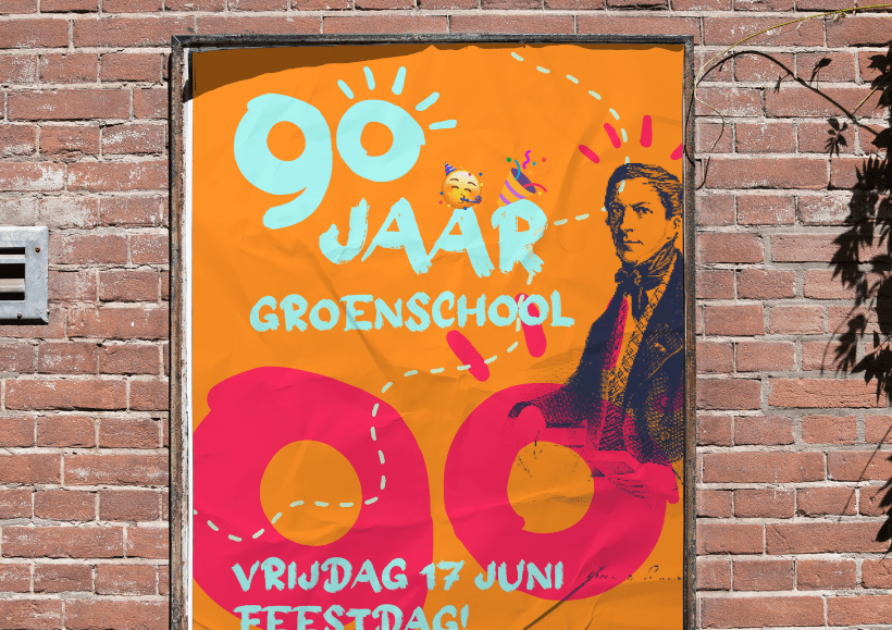
Groen van Prinstererschool 90th Anniversary Year Event Identity Design
In the 2021-2022 school year, the school celebrated its 90th anniversary. In February 2022, Mr. Upside was asked to provide the logo and visual communication for the 90th anniversary...